
Fighting Illiteracy With Typography
The intriguingly beautiful calligraphic principles of Arabic script have long defied attempts to facilitate mass production by print technologies developed for Roman letters. Unified Arabic is one such attempt, and significant obstacles stand between it and widespread adoption.
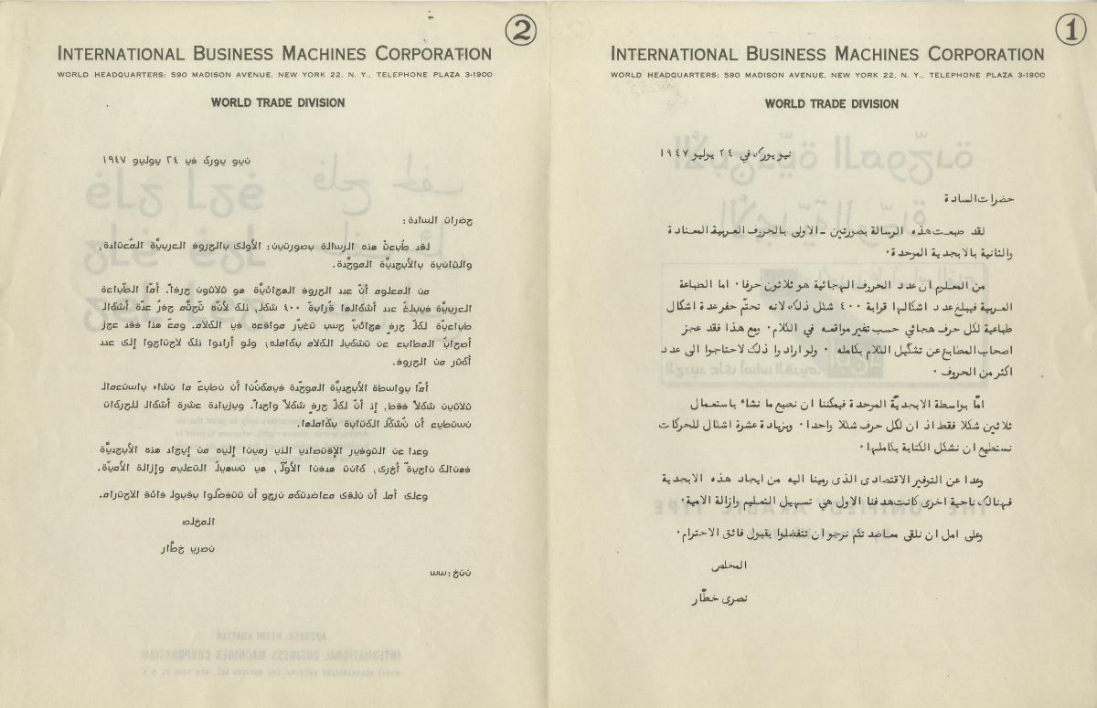
Cover photo: Filing for design patent for UA Beiruti, in 1947 (Image courtesy of Unified Arabic Archives.)
In 1932, a Lebanese architect walked into a classroom at the American University of Beirut to fill in for a professor who taught basic Arabic typing skills. In an effort to welcome the class, he started typing ahlan wa sahlan (‘welcome’), but, finding it difficult to locate the right keys for the right variation of the letter heh, he mistakenly typed an initial heh form instead of a medial one. He noticed, however, that what he had typed was still perfectly legible. He suddenly realised that by reducing the number of letter variations, the problem of finding keys on the typewriter could be easily solved without affecting the legibility of the text. He decided then and there to work on unifying all the variations of the Arabic letters. The architect’s name was Nasri Khattar, and he called his project Unified Arabic.
Students of Arabic start by learning its basic, unconnected letter shapes, only to be confronted with a myriad of wildly differing variations. The letter meem, aside from its four basic shapes, has more than 30 ligature forms.
Unified Arabic (UA) is basically a set of 30 letterforms, one for each letter of the Arabic alphabet, plus hamza and lam alef, eliminating the variant forms that make reading and writing Arabic difficult for beginners. The Arabic writing system is based on flowing calligraphic forms that connect letters within words, and the letters vary in shape according to their position in the word. Most of its 28 letters have four varying shapes, initial, medial, final and isolated, but, with the addition of ligature forms (used when writing specific letter combinations) and vocalisation marks, a complete set of glyphs can easily reach up to 150 shapes, depending on the complexity of the script. This made typing Arabic immensely complicated, as the large number of Arabic letter variants was too large to fit on the 44 available keys but Khattar realised that matters could be greatly simplified by distilling the hundreds of variant shapes into their most characteristic forms.
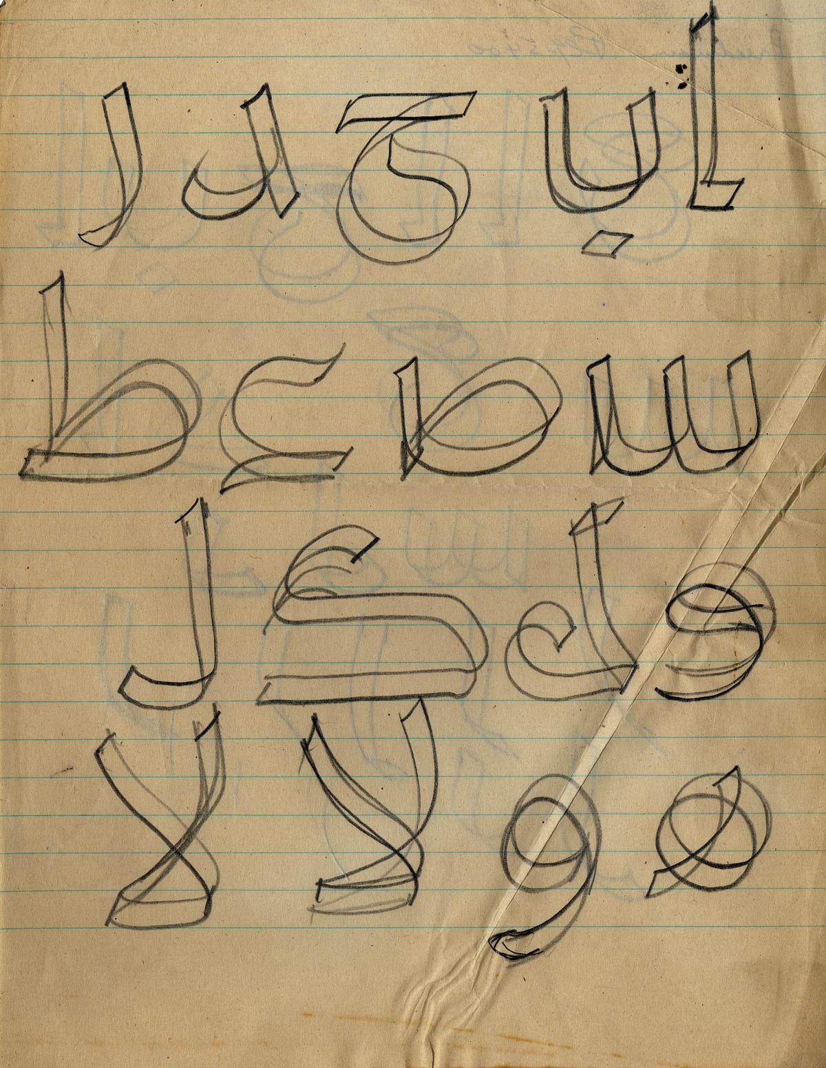
Sketches for Naskhi variations of Unified Arabic. (Image courtesy of Unified Arabic Archives.)
Using a reductive design process, Khattar worked to discover these characteristic shapes. Hundreds of sketches reveal a struggle with the most basic forms on both the functional and aesthetic levels, while other sketches try to find solutions—ranging from the simple to the bizarre—for the dots and the vocalisation marks. Furthermore, the letters are designed to be representative of the streamlined spirit of Western civilisation: quick, mechanised and labour saving, similar to Latin type forms and proportions, which Khattar acknowledged as one of his inspirations.
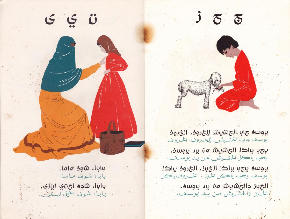
Sample pages from the children’s book ‘Shouf Baba Shouf’. The UA forms are placed next to the traditional ones for direct comparison and learning. (Image courtesy of Unified Arabic Archives.)
(Image courtesy of Unified Arabic Archives.)
But would typewriter manufacturers be interested enough to invest in the project? Remington Rand was the first to be approached, but the project quickly proved unrewarding, although one prototype Unified Arabic machine was actually produced. IBM, however, was quick to recognise UA’s socio-political implications, and so the journey began.
‘I am going to stake my reputation as a literacy man: I believe that, using this alphabet, the illiterate will learn in one-tenth the time that it now takes; and that means that probably ten times as many people will learn to read.’ — Frank Laubach
Unified Arabic was not the first attempt to adapt Arabic to mechanical printing processes. As early as the 15th century, printers had attempted to simulate the cursive forms using movable type, but their efforts to stay true to the script’s calligraphic nature resulted in type cases of up to 500 characters per font (roughly eight times the size of the Latin character set), making manual and mechanical typesetting a laborious task at odds with the demands of unit-based mass production.
Comparison of two typewritten letters, the left one typed in traditional Arabic, and the right one with UA IBM. Khattar proposed a keyboard layout designed for maximum efficiency and speed, mapping the most frequently used letters to the most accessible keys, so Arabic typists achieved higher speeds than English typists. (Image courtesy of Unified Arabic Archives.)
By the end of the 19th century, the detrimental social and economic effects of the impracticality of printed Arabic were clear: throughout the Levant region (modern-day Turkey, Syria, Lebanon, Palestine and Egypt) illiteracy was widespread, and books were scarce and expensive, available exclusively to the ruling class and clergy. However, after 400 years of stagnation under Ottoman rule in Syria and Lebanon, and influenced by French and English colonial rule in Egypt, the people of the region were gradually waking up to the distant thunder of the Industrial Revolution coming from the West, setting the stage for renewed efforts to facilitate reproduction of the Arabic printed word.
You seem to enjoy a good story
Sign up to our infrequent mailing to get more stories directly to your mailbox.Spurred by a growing rate of literacy, inadequate supply of books and favourable political circumstances, several reform trials in the Arab region began, instigating a movement of cultural change closely linked to the printed word. This movement, a form of a revived Arab Renaissance, called for a literary cultural awakening, new religious interpretations, modernised political ideas and language reform, opening the door to a new visual interpretation of the Arabic letterforms. By the beginning of the 20th century, the time was ripe for rapid modernisation. Unified Arabic, whose core idea was simplification by eliminating the unnecessary, seemed perfectly matched to its time.
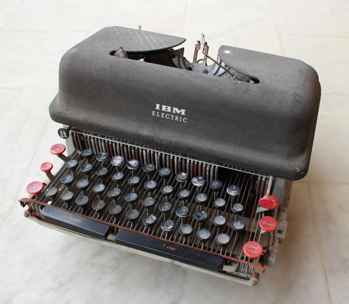
In n the 1940s, Khattar developed a close relationship with Thomas Watson, head of IBM, who supported the Unified Ara- bic project. This is one of only six IBM Unified Arabic typewriters produced. Traditional typewriters included initial and isolated forms of letters (accessible by using the shift key), plus some special keys for medial forms. The UA IBM used the basic keys, so each letter required just a single keystroke. (Image courtesy of Unified Arabic Archives.)
By April 1932, Khattar had completed his first set of Unified Arabic letters. A trained architect, Yale graduate and apprentice of Frank Lloyd Wright, Khattar lived and worked in New York. In 1947, IBM appointed Khattar its ‘ambassador’ to the court of King Farouk of Egypt, in collaboration with Dr Frank Laubach’s mission for the worldwide abolishment of illiteracy. He was sent armed with six brand new IBM electric typewriters bearing the new Arabic letters along with fully vocalised printed specimens of Al-Fatiha, the first chapter (surah) of the Holy Koran. In that same year, Khattar sent his first proposal to the Academy of the Arabic Language in Cairo, which was searching the Arab world for ways to reform the writing system. His proposal was set in Neo-Beiruti, a UA typeface with detached letters, which would soon be joined by Neo-Naskhi.
Unified Arabic letters enhance the 'printability' of Arabic. Khattar writes in one of his treatises that ‘a sober analysis of Arabic vs Roman systems will undoubtedly reveal that advances by the latter are not due to its superiority as an alphabet, but rather to its “printability”.’
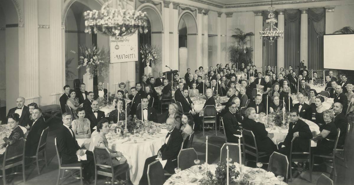
A lunch at the Waldorf Astoria Hotel in New York, organised by IBM to introduce the Unified Arabic project. The lunch was attended by many dignitaries and ambassadors, as well as supporters of the project, including Thomas Watson, head of IBM, and Frank Laubach, who developed a literacy programme benefiting millions worldwide. (Image courtesy of Unified Arabic Archives.)
The Academy did not accept his proposal, but Laubach proved to be a firm supporter. He recounts in a letter to Khattar: ‘I had a very exciting experience this afternoon. They brought in an illiterate girl… I taught her one lesson in front of one class, and another this PM in front of another class… She is ready right now to read any easy book with KHATTAR LETTERS… OH, how I pray you may succeed, for learning Arabic will be child’s play when they use your letters.’
In 1957 Khattar received another big boost in the form of a grant from the world-renowned philanthropic institution, the Ford Foundation. It resulted in the official establishment of the Unified Arabic Alphabet Foundation (UAAF), a not-for-profit educational organisation concerned with developing simpler typographical methods of reproduction. From his centre of operations in Beirut, Lebanon, Khattar set out on the second stage of his journey, focusing on marketing UA, manufacturing UA metal type, and publishing educational booklets using UA as the main text typeface. His efforts included several exhibitions showcasing the system’s benefits, as well as a short promotional movie featuring the marionette work of the famous puppeteer Bill Baird.
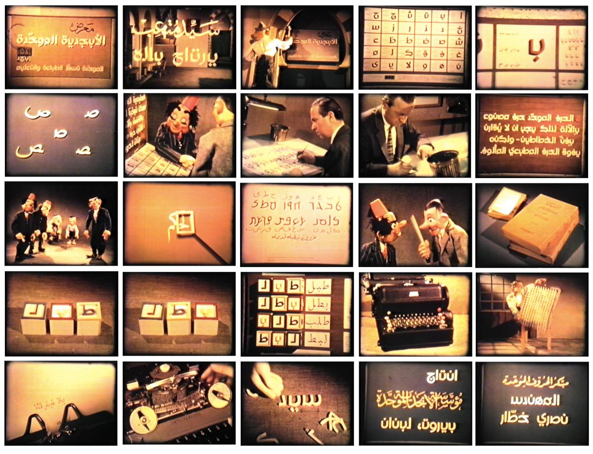
As an advertising vehicle for UA, a short movie was produced in 1957. The 15-minute documentary narrates advantages of using US by means of marionettes animated by the celebrated American puppeteer Bil Baird and his crew. (Image courtesy of Unified Arabic Archives.)
He also sent a second proposal to the Academy, this time with a full repertoire of Unified typeface styles including ones using connected letters such as UA Neo Kufic, UA Classiky, UA Al-Raya, UA Makana/Al-Najeeb and Al-Sayyal. It later became known that his proposal played a pivotal role in the Academy’s search, and was one of three finalists out of a total of 266 that were selected for debate within the Academy.
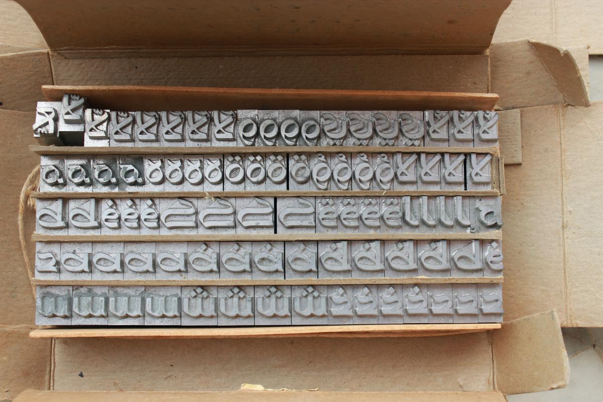
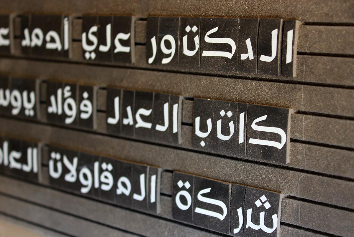
Unified Arabic Naskhi hot metal type (Image courtesy of Unified Arabic Archives.)
Unfortunately for Unified Arabic, time was not on its side. Interest in the concept waned as technology advanced, creating systems more capable of handling Arabic’s large character set and cursive nature. As first the Linotype machine and then digital publishing systems were introduced, the need to accommodate the limitations of older mechanical processes disappeared.
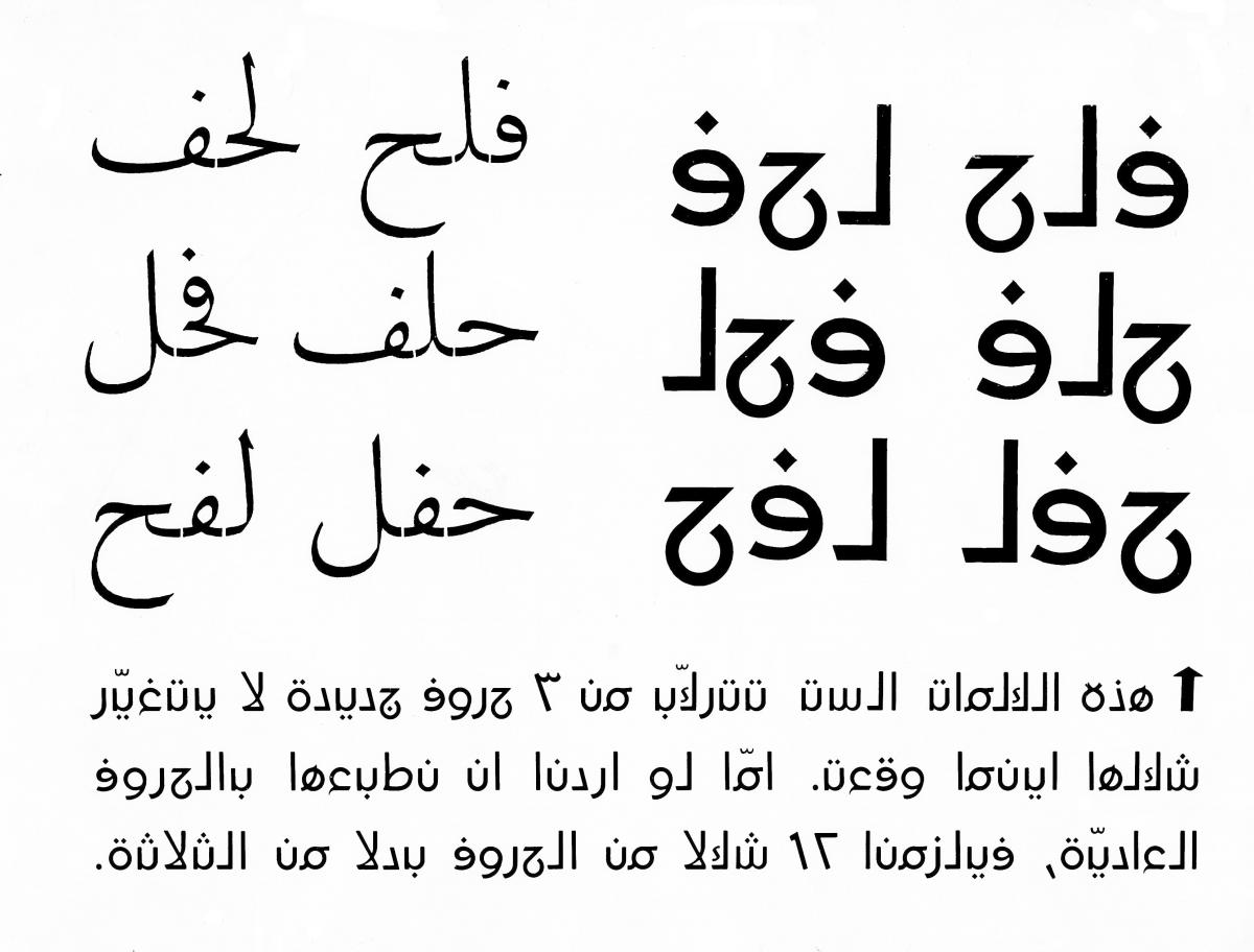
An excerpt from a promotional brochure explaining the concept of Unified Arabic, which gave each letter of the Arabic alphabet a single, unified shape. The translation reads: ‘These six words are made up of three letters that do not change form irrespective of their position. Printing them in traditional Arabic would require twelve variant forms instead of just three.’ (Image courtesy of Unified Arabic Archives.)
At first glance it may seem that all the favourable conditions for Unified Arabic to flourish had converged: a recognised need for language reform, a simple reductive type design that solved a long-time printing problem, support from IBM, funding from the Ford Foundation, patents and copyrights registered in the US and other countries, an extensive marketing campaign and prototype products, not to mention endorsements from people of stature in the field of linguistics, education and literature. And yet, entrenched and immovable forces stood in opposition, forces that cannot be attributed to specific religious scholars or educational ministers or substantive examples of opposition to UA in daily life.
To begin with, language and form are closely related in the Arab world, and the calligraphic nature of Arabic script is an essential aspect of Arabic cultural identity, an aspect of greater significance than Western-style economy and efficiency. UA’s concessions to the limitations of a Western technology were not seen as a mere simplification of a complicated writing system, but rather as a surrender to Western standards and a rejection of Arab culture and heritage. The Arab world saw its highly complex language as very much alive, manifesting itself in magnificent calligraphic practice, widespread use and flexible design forms. The Arab world was a truly calligraphic world that accommodated complexity, but rejected simplicity, which it considered retrograde.
Furthermore, since the Quran was revealed to the Prophet Mohammed in Arabic, the language and its letters are absolute and holy, nearly untouchable, a uniting factor forming a brotherhood amongst Arabs. Ninety per cent of Muslims pray in Arabic, whether or not it is their mother tongue. This religious dimension also makes any language reform a highly complex and sensitive issue with moral implications, an idea perhaps difficult for the Western mind to fully grasp.
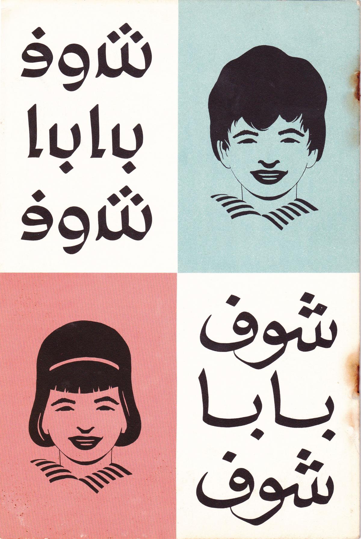
The 1955 children’s textbook Shouf Baba Shouf using a Unified Arabic typeface (UA Neo Naskhi) compared to the same text set in traditional calligraphic type. Traditionally, a child learning Arabic needs to learn the different forms of each letter and the ways to connect them. Unified Arabic, on the other hand, teaches them separate letters whose forms don’t change depending on context, which is significantly easier for five-year-old children. (Image courtesy of Unified Arabic Archives.)
In 1986, Nasri Khattar was nominated for the Nobel Peace Prize for his lifelong Unified Arabic project and its implications for the fields of linguistics, literacy, printing, computers, and telecommunications. He was probably the only designer / typographer considered for the prestigious award.
In one sense, new technologies made Unified Arabic obsolete before it could overcome the massive obstacles opposing its adoption. But from another point of view, the issues that led to its development still demand resolution. The paucity of Arab book printing is not the only issue; the language’s presence online, in digital systems and their applications are also important considerations in today’s increasingly electronic world. And while digital typesetting is coming closer and closer to imitating various styles of Arabic calligraphy, the economy of illiteracy may yet precipitate a system overhaul, including a simplified writing system.
In 2013 UA Neo B and UA Neo N, digital versions of UA Beiruti and UA Neo Naskhi respectively, were released by Pascal Zoghbi of 29 Letters type foundry. The revival is an attempt to give educators and designers the opportunity to explore the usage of unified detached Arabic typefaces. It opens the doors wide for real-world tests and applications that could eventually break down the old barriers to UA’s adoption, making it an old idea still worth revisiting.
