
The Language of Colours
The Munsell Color System catalogues the broad range of colours perceivable by the human eye and reproducible by imaging technology. Its colour space is based not on theoretical ideals, but on empirical observation of what the average person can actually see.
Cover photo: Three dimensional colour charts developed by Albert Munsell in the early 1920s. (Image courtesy of the Hagley Museum & Library.)
‘Do you see the same red as me?’ It may seem like a strange question, perhaps the musing of a child or philosopher trying to understand the nature of perception and reality. But it may be a serious enquiry from a brand manager trying to ensure visual consistency across a product line. Coke red, after all, is different from BBC red, Canon red, Levi’s red, LG red, Red Cross red and so on.
Coke red, BBC red, Canon red, Levi’s red, LG red, and Red Cross red.
In 1905, American painter and inventor Albert Henry Munsell illustrated the problem by quoting a letter to London from Robert Louis Stevenson who was trying to furnish his Samoan home.
‘For a little work-room of my own at the back I should rather like to see some patterns of unglossy—well, I’ll be hanged if I can describe this red. It’s not Turkish, and it’s not Roman, and it’s not Indian; but it seems to partake of the last two, and yet it can’t be either of them, because it ought to be able to go with vermilion. Ah, what a tangled web we weave! Anyway, with what brains you have left choose me and send me some—many—patterns of the exact shade.’
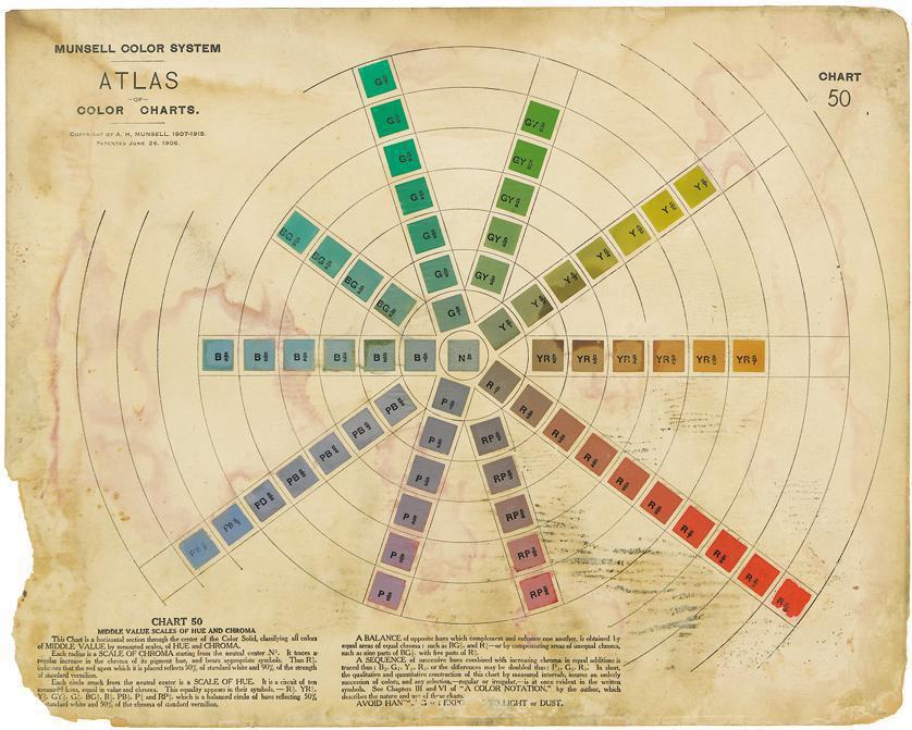
Munsell introduced his system in 1913 with the publication of the Atlas of the Munsell Color System, which featured 15 colour charts consisting of several hundred colour chips arranged according to the three characteristics of hue, value and chroma, corresponding to dominant wavelength, brightness, and strength or purity respectively. The system is used internationally for specifying opaque colours of dyed or pigmented surfaces.
What was needed, Munsell realised, was a system for communicating colours precisely. He likened the need for a colour notation to the need for musical notation: a standardised system for representing pitches, rhythms and dynamics enables a tune written by one person to be reliably reproduced by another person. Munsell hoped that a system that could notate hue, value and chroma (parameters roughly equivalent to the better-known hue, lightness and saturation) would usher in a new age of chromatic literacy. The system he developed, described in A Color Notation in 1905, and demonstrated by the Atlas of the Munsell Color System in 1915, remains in use (with refinements) to this day.
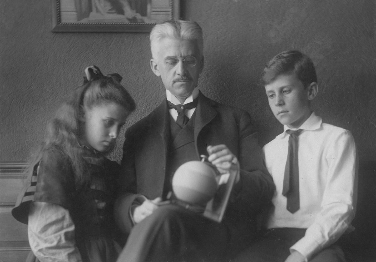
Albert Henry Munsell and his family observing the Munsell colour sphere in motion. Munsell devised the first system for numerically describing colours based on the parameters of human colour perception. (Photo courtesy of the Hagley Museum & Library.)
There are, of course, several such systems. RGB and CMYK allow (properly calibrated) monitors and printers to reproduce the colours of screen and print images, while products like the Pantone System index colours to standards that can be shared across industries. And although Munsell predates these, it is still used by the United States Geological Survey to describe soil colours, as well as by some brewers, dentists, artists, and manufacturers looking to colour-match their products.
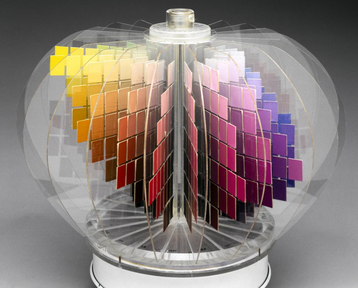
The three-dimensional Munsell colour tree. Albert Henry Munsell discovered that if hue, value and chroma were to be kept perceptually uniform, achievable surface colours could not be forced into a regular shape. In this model, colour samples are mounted radially on vertical semicircular plastic plates. These show changes in colour hue around the circular axis, while colour saturation increases outwards, and brightness from top to bottom. (Photo courtesy of Getty/Reporters.)
To be sure, Munsell was not the first to attempt to codify a catalogue of colours, but earlier systems tended to be based on idealised solids such as cones, spheres, cylinders, or cubes, limiting their usefulness in the real world. Munsell’s system is based on two highly practical factors: the first being the empirically determined parameters of human colour perception.
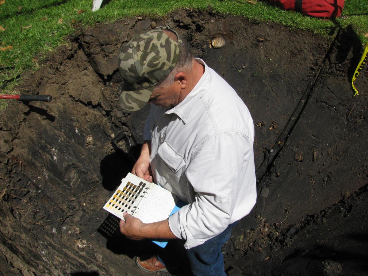
Environmental scientist Brent Macolley assessing soil using Munsell for soil classification. When examining the soils on site, a small soil sample is taken and each layer is characterised by its structure, texture and colour. The Munsell Color book is used to identify the dominant colour within a particular layer, as well as other colours that appear in each layer. The soil characterisations help in determining an ideal site for creating a wetland. (Photo courtesy of Munsell Color.)
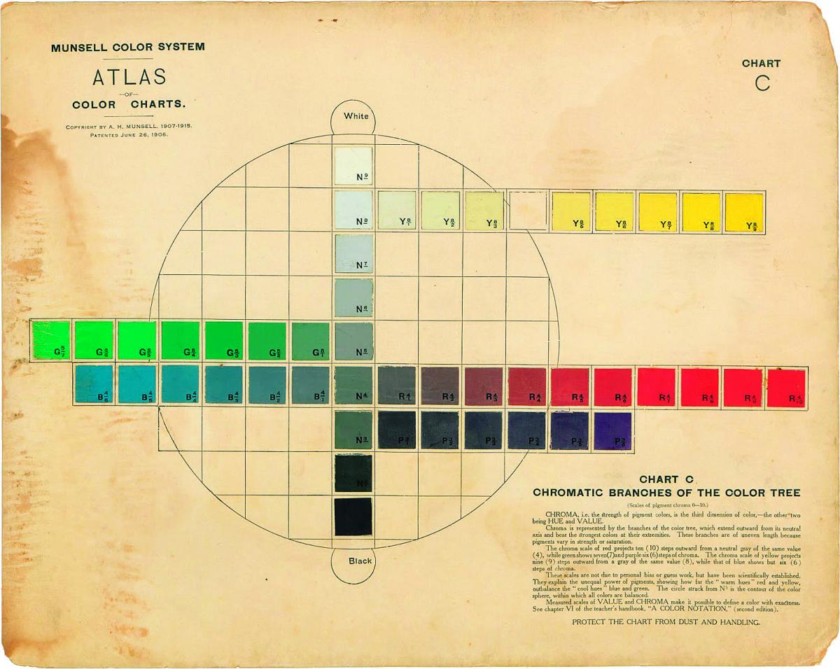
Munsell conducted a series of painstaking experiments that involved presenting test subjects with spinning discs covered by different ratios of coloured areas to determine which seemed equally dark/light/dull/rich, ensuring that every swatch of colour would be perceived by the average observer as being the same. Based on this data, Munsell constructed a ‘tree’ with hues arranged in a wheel of colours, red to yellow to green to blue to purple and back to red (with half steps YR, GY, BG, PB, RP between), values arranged in ten steps up the trunk from black to white, and chromas radiating outward from least to most saturated with no upper limit.

This is the slice of the tree that reveals 7.5 Yellow and 7.5 Purple-Blue, generated by the Munsell DG iPad app.
Notice that there are far more distinguishable yellows than blues in the brighter values and more blues than yellows in the dark. The smaller squares represent colours that exist in the Munsell system but that can’t be accurately displayed on the iPad’s RGB screen. (In converting from the screen to CMYK print, even further distinction has been lost.)
You seem to enjoy a good story
Sign up to our infrequent mailing to get more stories directly to your mailbox.The second practical factor in the Munsell system is the range of capabilities afforded by existing print and dye technologies. In other words, for a colour to make its way into the atlas, it must be not only humanly perceivable, but also reliably reproducible. Today, creating the 1,600 individual colours for the comprehensive Munsell Book of Color, Glossy Edition takes 25 to 30 colourants, says Art Schmehling, Munsell Product Manager at X-Rite. Sometimes, the range of colours in the book has expanded thanks to the discovery of new pigments. At other times it has contracted, for example as industry turned away from the vibrant but toxic pigments based on heavy metals.
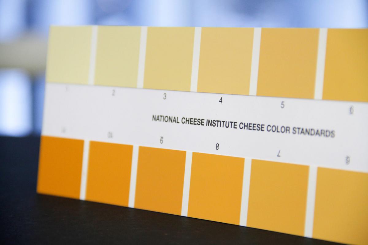
The National Cheese Institute’s Color Standards uses a version of Munsell system with 12 colour chips intended for the visual colour grading of cheese. Cheddar should have a colour between 6 and 8, Monterey Jack cheese a colour not darker than 2. The Munsell colour system helps to establish colour standards for a variety of items such as cheese, bacon, milk, chocolate, oil, sugar, porcelain, wood and even lunar soil. (Photo courtesy of Munsel Color.)
As a result, the Munsell Color Tree has a pleasingly irregular shape generated through a negotiation between human perception and the materials we have available to make colours.
