
Point Me Where It Hurts
Kwikpoint guides enable basic communication between US troops and locals in Afghanistan and Iraq. Each one requires careful research how to communicate across barriers of language and culture.
Cover photo: Afghan Improvised Explosive Device emplacement (Image courtesy of Kwikpoint)
The Afghans were not offended by the cartoonish depictions of bomb detonations, hidden Improvised Explosive Devices (IEDs), or hostage situations. No, the illustration choice that they rejected was the flesh-toned skin of the medical diagram’s human form. ‘It was considered pornographic,’ says Alan Stillman, founder and CEO of the visual communications company Kwikpoint. ‘People wouldn’t use it and didn’t like it because they’re so religious there.’
At first glance, the androgynous medical illustration, along with miniaturised drawings of IEDs, turban-topped bomb-makers, and soldiers alternately inquisitive and distressed, could be mistaken for yet another piece of dark comedic satire à la South Park or Family Guy. But these cartoons are not cynicism-wracked bits of entertainment. Rather, they constitute unique graphic tools available to US armed forces on the battlefield: Kwikpoint’s Visual Language Translators.
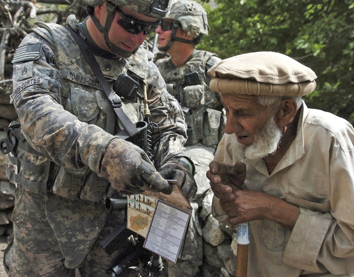
Around five million of Kwikpoint’s guides and cards have been issued to military personnel. The laminated, pocket-sized pamphlets are handier and more durable than conventional printed dictionaries and manuals. Above, a US soldier in Afghanistan communicates with a local elder using one of the Kwikpoint Visual Language Translators. (Photo courtesy of Kwikpoint)
What at first glance appears to be a set of surreal and violent military cartoons is, in fact, a lifesaving tool.
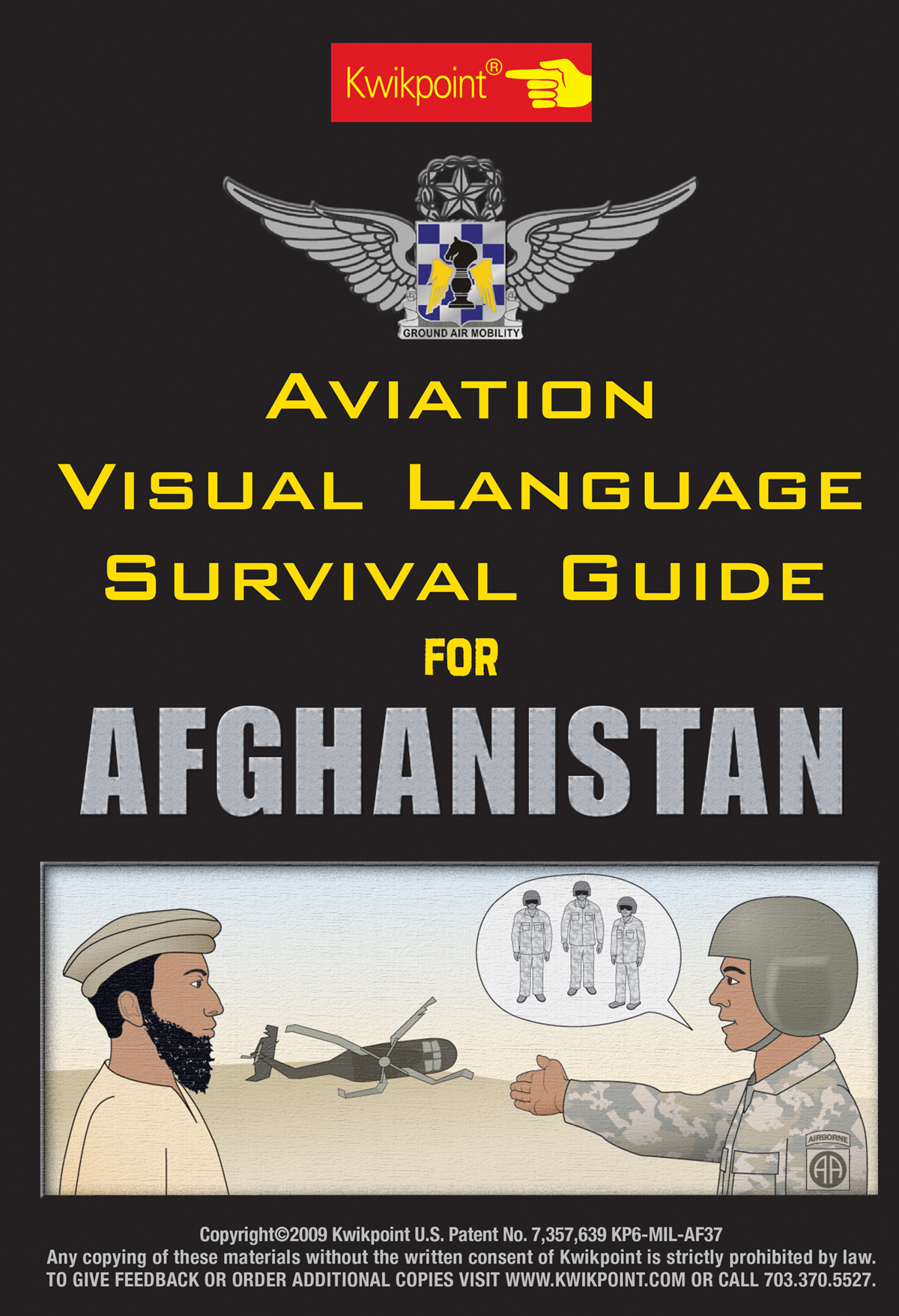
The Afghanistan Survival Guide was developed specifically for the needs of aviation personnel who might be downed, experience equipment failure, or be separated from their group in unfamiliar territory. (Image courtesy of Kwikpoint)
Approximately the size and shape of a fold-out road map, the guide’s laminated panels contain a series of thematically grouped pictograms enabling communication between soldiers and ‘native locals’. Need medical attention? Point to an ambulance. Need to know where the guns are stashed? Point to the picture of a weapons cache. The icons symbolise everything from modes of transportation (car, van, bus, bicycle, camel, etc.) to complex concepts relating to transactions and health (I’ll reward you for telling me where to find a downed helicopter; show me where it hurts), all at the tip of a soldier’s finger.
You seem to enjoy a good story
Sign up to our infrequent mailing to get more stories directly to your mailbox.The Kwikpoint guides occupy a strange space in the world of 2D images, not quite info-graphics but certainly more than mere illustration. Visual Communications Director Stephanie Stierhoff says that working on the pictograms is not dissimilar to working on the icons and logos she designed during a stint on Madison Avenue. Both require simple forms and distinguishing features. Both are distillations of a larger idea. Both aim to achieve immediate viewer recognition. And yet, as she says, making the guides is different from making any other kind of product.
‘This affects people directly,’ Stierhoff tells me. ‘When people go out in the field, they’re using our guides for very critical ideas, whether it be a user guide to put on a ballistic vest correctly or communicating ideas to a local in Afghanistan. If we don’t do our research, and don’t convey these ideas precisely, as precisely as we can possibly do it, it could really have an effect on that person.’
Hence the research. And the necessity to address the pornographic implications of their flesh-coloured medical image. After a bit more experimentation, the Kwikpoint design team changed the flesh colour to a cyanotic robin’s-egg blue, transforming a pornographic human figure into an abstract one. ‘People look at it and kind of laugh and go, “Well, are you looking for aliens?” or “Do they have blue people there?”’ relates Kwikpoint’s founder Alan Stillman. He continues, ‘And we say, no, this is just a cultural adjustment we have to make.’
Minor graphic design choices can have major cultural implications, necessitating rigorous research and testing.
Stillman, a maths whizz who got into Cornell’s mathematics programme at the age of 16, didn’t begin his career with the dream of creating military translators and IED identification guides. Rather, the idea was sown along a 15,000-mile international bike journey he took in the late 1980s. Outside Hungary, Stillman and a friend clipped pictures out of magazines to illustrate a few basic needs, the idea being that if all else failed, they could implore someone for help by pointing to what they wanted.
After Stillman returned to the States in 1988, the idea of making a picture-dictionary continued to pull at his thoughts. The concept was simple yet effective: a collection of pictograms that could be pointed at to communicate the things a traveller might need. Finally, in 1989, after failing to find similar products on the market, he decided to take a shot at making one himself.
Stillman bought a Macintosh computer with the idea of using clip art for his symbols. All he’d have to do was find the right digital images and assemble them into his visual dictionary. But the lack of graphic consistency and style among the icons irked him. ‘The problem was that I wasn’t an illustrator,’ Stillman tells me. ‘So I took a job at a Macintosh graphics lab in Virginia, started learning about desktop publishing, and found a bunch of artists.’ In exchange for their pictograms, Stillman would teach his cadre of artists how to use Illustrator 88 or Freehand. His spare time was spent poring over travel guides and creating content lists.
The first guide came out in the summer of 1991, and for several years Kwikpoint catered to the visual language needs of travellers. But three days after 9/11, they received an email from a marine major in the Pacific. The marine had bought one of their travel guides in an airport and used it to communicate while on duty in East Timor. He asked if Kwikpoint could make a custom guide with military pictures of tanks and guns on one side and the travel images on the other. They sold him a relatively small batch of 2,000 guides.
As the tourism industry nose-dived, Stillman and his team saw potential in the military market. They set to work creating products that would facilitate the most common and important interactions that military personnel might encounter in the field. By 2004, Kwikpoint’s products had become standard issue for all US troops going into Iraq and Afghanistan. There are now dozens of Kwikpoint guides tailored to the specific needs of various missions and groups: guides for aviation teams, medics and infantry, and visual instruction guides illustrating proper procedures for things like putting on a ballistics vest or detecting an IED. The military is now their largest client and there are approximately five million of the various Kwikpoint guides and smart cards in the field.
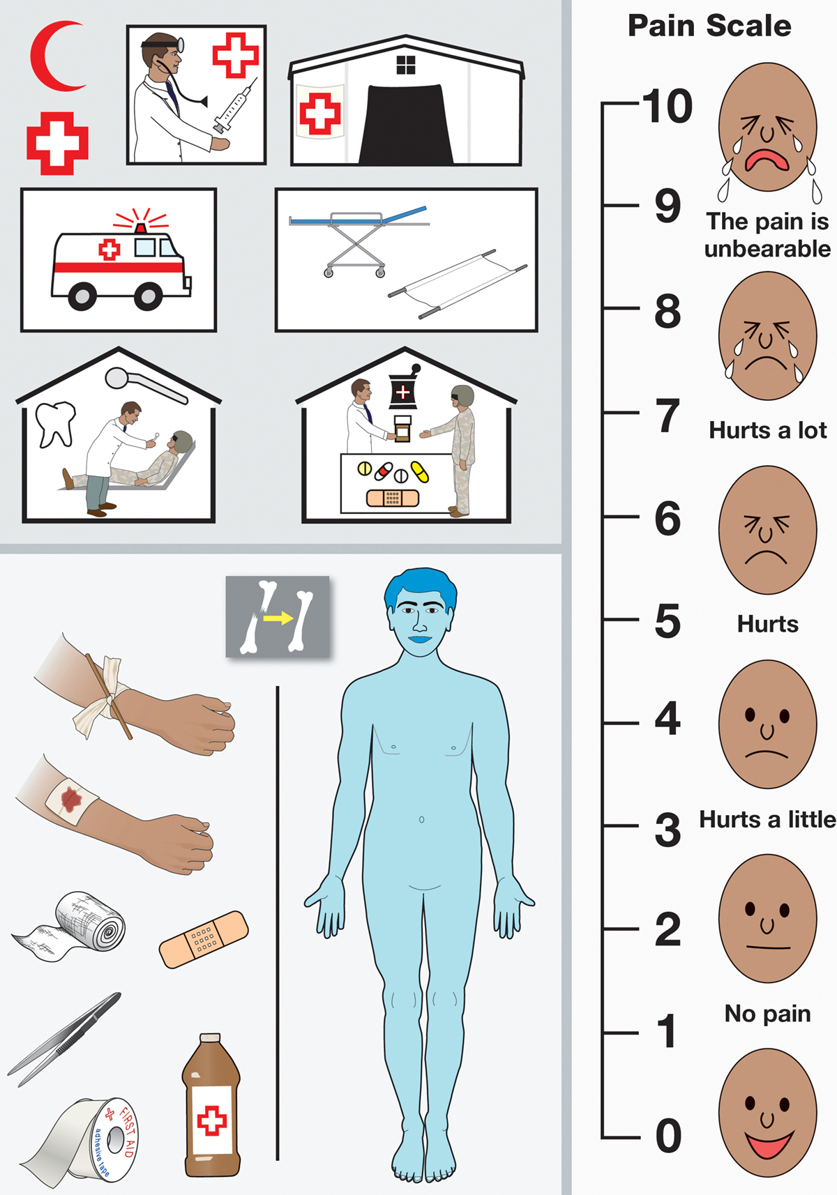
A cyan tint was used in a medical diagram of a human figure, after the ordinary flesh-toned skin was rejected by the Afghans as being pornographic. Designing the visual translators involves extensive research, including the help of linguists, graphic designers, military consultants and technology engineers. (Image courtesy of Kwikpoint)
Sample from the Aviation Visual Language Survival Guide for Afghanistan. It contains essential graphics to help communicate various situations — for example to request help or to identify danger—all by pointing to pictures. (Image courtesy of Kwikpoint)
Developing each product can take anywhere from three months to a year, but the process always begins by identifying the specific concepts and items a user will need—things like how to make a bomb, how to identify an IED, types of weapons, tactics, ambushes, etc. From this ‘shopping list’, the design team develops representative sketches. Images are either nouns or complex concepts. The former are easy enough; if they need to represent a toaster, the illustrators will draw a toaster. But conveying complex actions or visual phrases like ‘hide me’ or ‘tell me where you saw the downed helicopter’ takes multiple iterations and testing to distil an idea into its simplest and most understandable form.
Thinking again of the comedic impression of cartoons, I ask Stierhoff about the aesthetic look of the guides, why they chose illustrations over photographic images. ‘Well,’ she replies, ‘photographs are very specific. We’ve done testing on this before and if we show a picture of a yellow Mercedes… they’re going to say, “No, I didn’t see a yellow Mercedes today”. We don’t want to be that specific. It’s “Have you seen a vehicle with four wheels and four doors?” [Drawings are] more symbolic. That’s the difference between a photograph and an illustration or icon or pictograph.’
Approximately five million of Kwikpoint’s illustrated guides and cards are in circulation.
After icons are developed, they are tested by a variety of people to make sure that they convey their intended meaning, that the visual metaphor works. ‘You have to map it to your cultural audience,’ says Stillman. ‘If you’re making a guide for Afghanistan, you have to make sure that it works within the Afghan cultural realm. Because a metaphor of a light bulb might work here but it might not work in Pakistan.’
According to Stierhoff, Kwikpoint does an extraordinary amount of research in the cultural area. They call in subject-matter experts from the military, IED-defence organisations, and individuals who have recently arrived from various countries. ‘We’ve gathered quite a cache of subject-matter experts qualified to give us very current advice on the regions and the people.’
Stillman recounts the time they were developing pictograms to represent the various places a bomb might be hidden. Explosives are often concealed beneath rubbish, ‘so we had to have some icons for garbage in Afghanistan. And it turns out what you and I would throw away and call garbage in America is not garbage in Afghanistan. We went out to an Afghan restaurant, and we interviewed some people who are kind of like busboys and waiters who had just come from Kabul within the last six months… Our garbage design is based on this.’
The layout and information architecture of the guide is another chief consideration. Images are arranged in a way that enables mental association and facilitates pointing at multiple images in a sequence. Objects and concepts are kept within their main categories to aid in recognition and are often located near an associated ‘anchor graphic’ to emphasise meaning. So various bomb components and explosives will be anchored by an image of a bomb-maker. Their proximity helps the viewer to understand their significance.
The panel depicting the Village Elder in the Afghan Aviation Guide, for instance, was afforded a prominent visual position in the layout and given more room than any other single concept. Stierhoff tells me that elders are supremely important figures in the community, and they took special care to give them importance with visual space and size. She says, ‘If we do it wrong, and a soldier is showing it to them, it can be very embarrassing or downright insulting and cause issues… In the case of the Elder, it was a very key idea that we had to put in there. Oftentimes, the soldier has to find this man in the village, and you’ll have to go perhaps from door to door, so you want to have the picture be respectful and representative of the idea.’
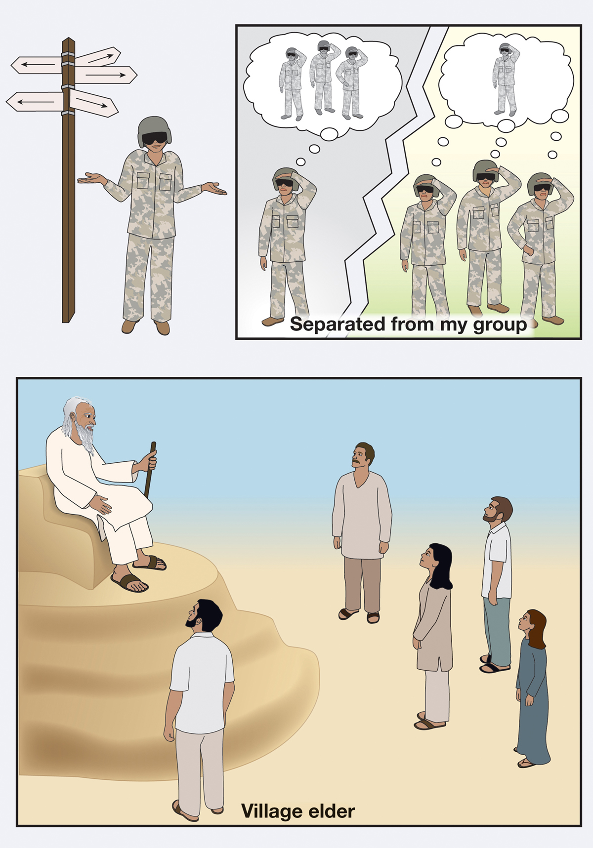
The village elder merits a generous amount of the limited space in the Afghan Aviation Guide in order to illustrate his supreme importance and to show respect to the locals. (Image courtesy of Kwikpoint)
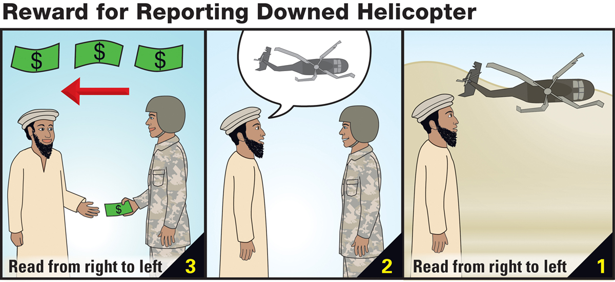
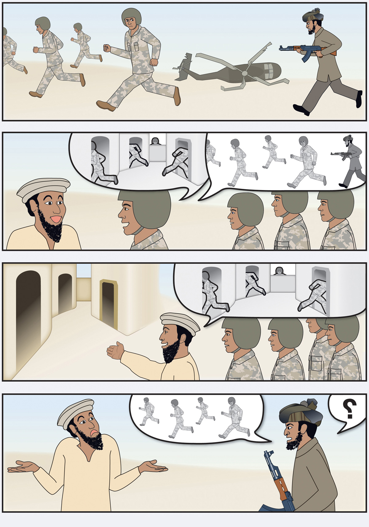
Complex concepts, such as getting a monetary reward for reporting a downed helicopter, are shown in sequences of images not unlike comic strips. Aware that Afghan languages are written in the opposite direction from English, designers of the sequence included three reminders that it should be read from right to left. (Image courtesy of Kwikpoint)
The careful research and cultural considerations seem to have paid off. A video on Kwikpoint’s website says the guides have helped to find ‘countless thousands of bombs. Saved thousands of soldiers,’ and there are a number of testimonials.
One features an infantryman, Corporal Josh Collins, recounting an incident he witnessed while deployed in Iraq: a distressed Iraqi man ran up to the military checkpoint yelling for a hospital. Collins and his comrades used the Kwikpoint to asked him why he needed a hospital and he pointed to the picture of a gas pump, a picture of a little girl, and made a drinking motion. They deduced that his little girl had consumed gasoline and were able to immediately get her proper medical attention. Collins ends the story by looking directly at the camera and saying, ‘I believe that using the Kwikpoint to find out exactly what happened saved his little girl’s life.’
I spoke with First Lieutenant Josh Bevcar, who was deployed for the first six months of the Iraq invasion in 2003, before the Kwikpoint guides were standard issue. Instead of the easy reference afforded by the pocket-sized guides now available, his unit had to rely on ‘big manuals on Iraq that were unwieldy and in short supply.’ He told me that just having the IED smart card with its visual guide, points on Middle Eastern culture, and a few Arabic phrases ‘would have been incredibly useful and helpful while deployed’.
But Kwikpoint’s guides are not a catch-all silver bullet in the field of military language communication. Dmitry Solominsky, who served in Iraq from 2008 to 2009, was less enthusiastic about the guides. He told me that the guides were in no way a replacement for human translators and that he and his team members did not use them. He continued, ‘A human being can tell you things that a paper can never tell you. They know what a neighbourhood is like, what kinds of people are there. They know local dialogue and slang. They know if someone is lying to you. You can never place all of that on a piece of paper.’
With the removal of military troops from Iraq and the decreasing number of new deployments to Afghanistan, Kwikpoint is scaling back their development of combat-orientated military guides. They continue to design training materials but their interest in creating life-saving graphics is shifting from the battlefield to the field of medicine. While they still work on making illustrations to help soldiers identify IEDs, the Kwikpoint team is also using its visual language tools to help everyday citizens recognise the markers of a stroke. ‘My own grandmother died of a stroke before my eyes when I was a child,’ Alan Stillman tells me. ‘Right now, only one in ten Americans knows how to spot a stroke. If you could get it to nine out of ten, you could save almost a million lives a year.’
